

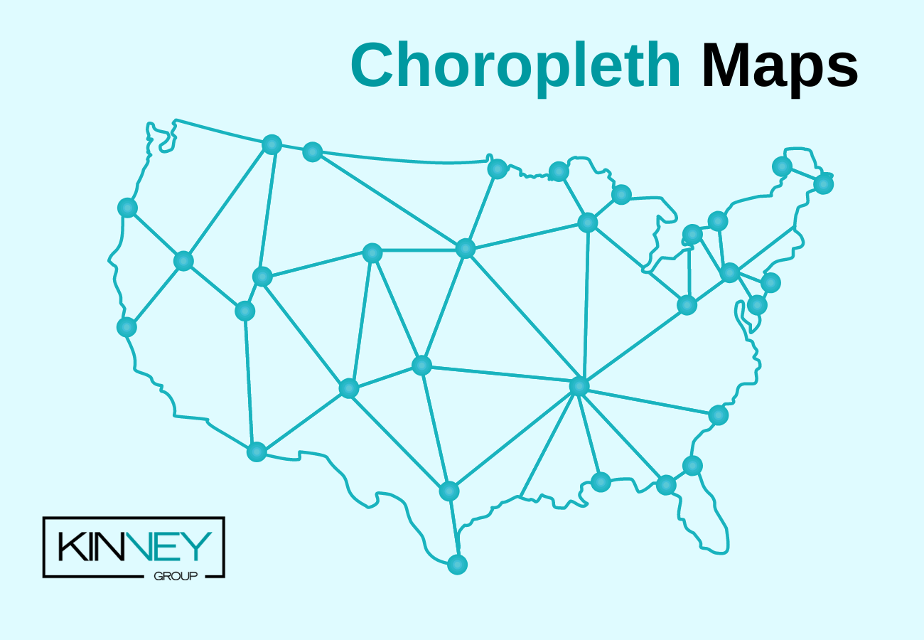
Splunk provides many visualizations to represent data. One of the most popular visualizations is the choropleth map which is best suited for location data.
What is a choropleth map?
A choropleth map is a type of map that uses colors, shades, and symbols to display the average values of specific data in a geographic location. Choropleth maps utilize KML or KMZ files, also known as ‘Keyhole Markup Language’ which use latitude and longitude coordinates to map out regions. You can create choropleth maps in Splunk using the choropleth visualization.
To get started, press play on the video to follow along with the written instructions.
How to Create a Choropleth Map
1. Choose your data.
I’m using a CSV file that I will be uploading to my Splunk instance. The first row in the file contains field names and the rest values.
This is what the CSV of Employee Records looks like when it’s ingested to Splunk:
source="employee_data.csv"
| eval Name=first_name + " " + last_name
| table Name ip_address state
2. Select the KML file for the choropleth map.
Let’s take a look at the KML file I will be using to create our choropleth map:
| inputlookup geo_us_states
Here we see a correlating field of state, and note the coordinates which define each state’s regions.
3. Select the choropleth visualization.
Next, let’s choose the choropleth visualization. Notice that the count for each state is set to 0, causing all states to display the same highlighted color. You’ll want it this way for now as we head into the next step.
4. Create the query.
Now, let’s dive deeper into the employee CSV data to create our query
source="employee_data.csv"
| stats count by state
Note that all states now have a count. We will use this data to populate our choropleth map.
5. Correlate the KML file’s featureId field.
In order to populate the data into the choropleth map, we will use the ‘geom’ command to correlate the KML file’s featureId field which included states to the field name of state found within the employee CSV data.
As you can see, each state has a count of the number of employees residing within, as well as the coordinates used to map each state’s boundaries
source="employee_data.csv"
| stats count by state
| geom geo_us_states featureIdField=state
6. Create custom values.
While Splunk’s default formatting can be great for some datasets, let’s create custom values to use in our key and sort by on the map.
Using case statements, we are able to pass multiple argument and value pairs.
source="employee_data.csv"
| stats count by state
| eval count = case(count<10, "Less than 10", count>10 AND count<30, "10-30", count>30 AND count<60, "30-60", count>60 AND count<100, "60-100", count>100, "Over 100")
| geom geo_us_states featureIdField=state
7. Reset the null value.
Finally, let’s take care of that null value and set it to something more user friendly
source="employee_data.csv"
| stats count by state
| eval count = case(count<10, "Less than 10", count>10 AND count<30, "10-30", count>30 AND count<60, "30-60", count>60 AND count<100, "60-100", count>100, "Over 100")
| fillnull value="No Employees"
| geom geo_us_states featureIdField=state
As you can see, we now have a fully populated map visualizing the stats in which employees reside.
Splunk Pro Tip: This type of work can be a considerable resource expense when executing it in-house. The experts at Kinney Group have several years of experience architecting, creating, and solving in Splunk. With Expertise on Demand, you’ll have access to some of the best and brightest minds to walk you through simple and tough problems as they come up.
If you found this helpful…
You don’t have to master Splunk by yourself in order to get the most value out of it. Small, day-to-day optimizations of your environment can make all the difference in how you understand and use the data in your Splunk environment to manage all the work on your plate.
Cue Atlas Assessment: a customized report to show you where your Splunk environment is excelling and opportunities for improvement. Once you download the app, you’ll get your report in just 30 minutes.