Are you ready to unlock the true potential of your data? Splunk Visualizations offer a powerful solution for transforming complex information into actionable insights. In today’s data-driven world, organizations face the challenge of extracting meaningful patterns and trends from vast amounts of data. However, with Splunk Visualizations, you can effectively visualize and analyze your data, leading to informed decision-making and improved business outcomes. Let’s dive into the world of Splunk Visualizations and discover how they can revolutionize your data analysis processes.
What are Splunk Visualizations?
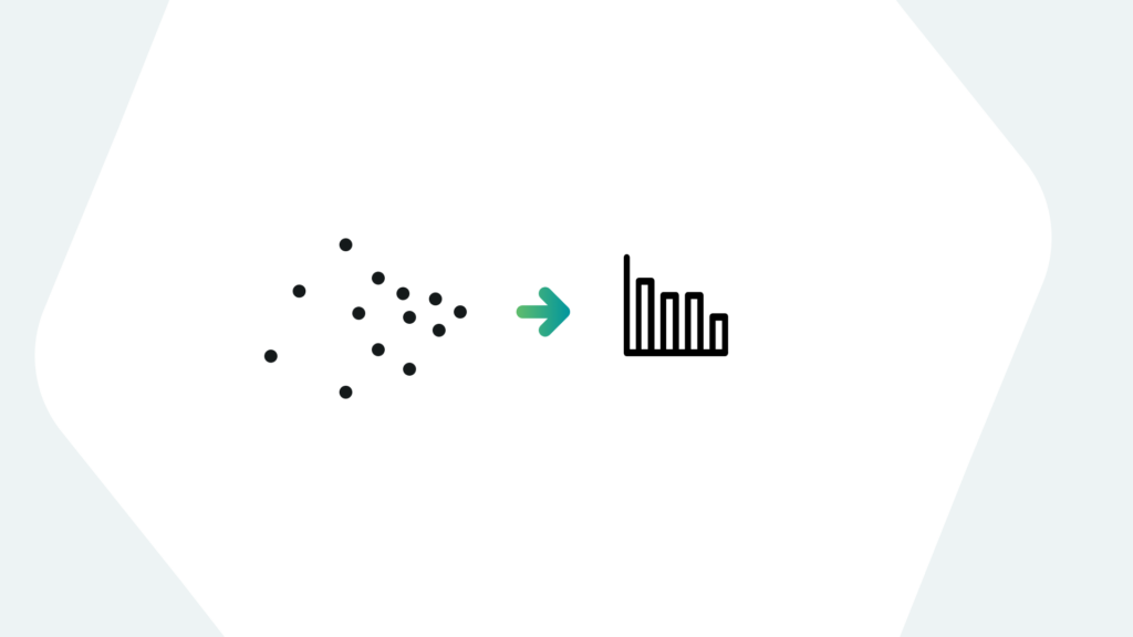
Splunk Visualizations, within the Splunk platform, provide a robust toolset for visually representing and interpreting data. With Splunk Visualizations, you can transform raw data into intuitive charts, graphs, maps, and dashboards. This feature allows users to uncover valuable insights, detect anomalies, and communicate complex information effectively. Whether you’re a data analyst, IT professional, or business decision-maker, Splunk Visualizations empower you to derive actionable intelligence from your data, facilitating data-driven decision-making.
The Benefits of Splunk Visualizations
Splunk Visualizations offer numerous advantages that enhance data analysis and decision-making processes:
- Enhanced Data Understanding: Visual representations of data enable quick comprehension of complex information. Splunk Visualizations allow users to identify trends, outliers, and correlations, resulting in a deeper understanding of their data. By visualizing data, users can easily grasp insights that might otherwise remain hidden.
- Improved Collaboration and Communication: Splunk Visualizations provide a common language that bridges the gap between technical and non-technical stakeholders. Visualizations facilitate effective communication and collaboration by simplifying complex information. This fosters data-driven decision-making across teams and departments, leading to better alignment and outcomes.
Types of Splunk Visualizations
Splunk Visualizations encompass various types, each tailored to address specific data analysis requirements. Some common types include:
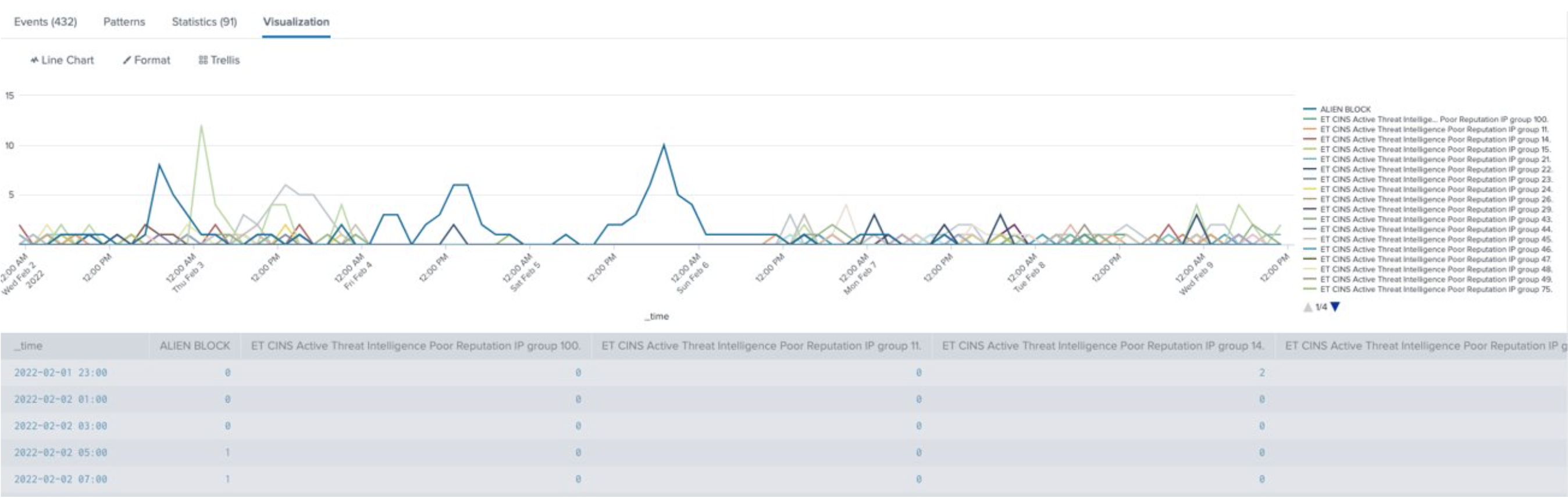
- Line Charts: These visualizations display trends over time, enabling the identification of patterns, seasonality, and anomalies.
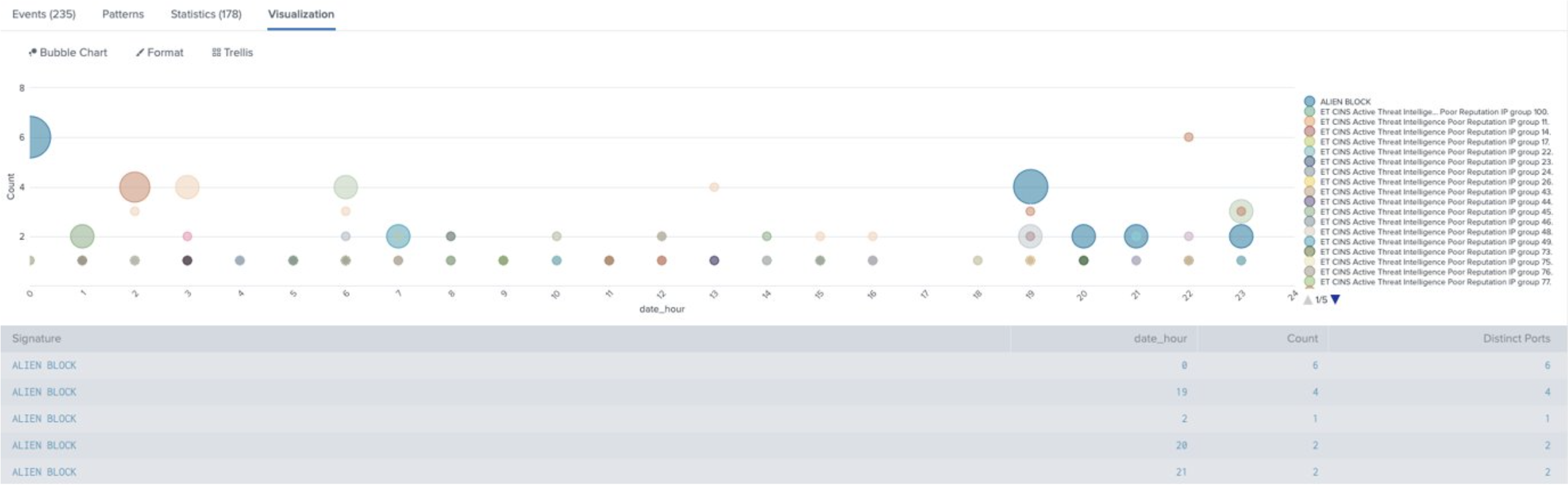
- Bubble Charts: By representing data points as bubbles, with size reflecting specific metrics, bubble charts assist in understanding relationships between multiple variables.
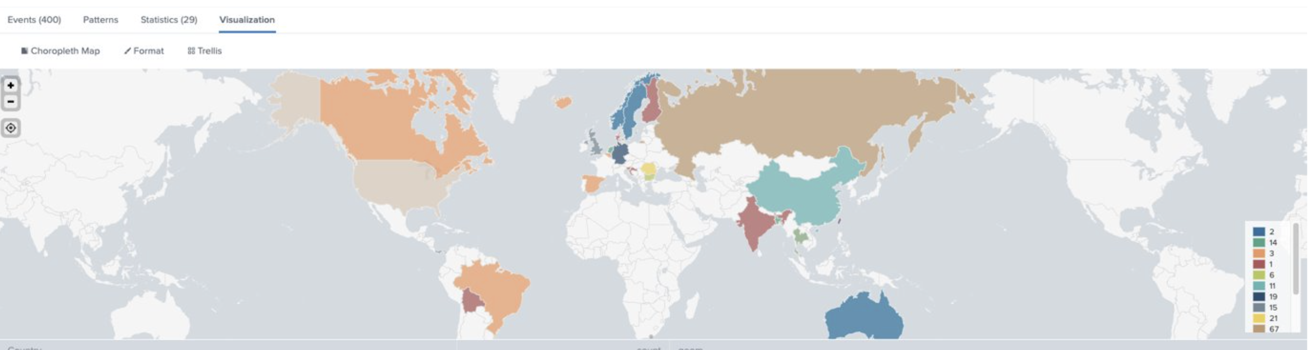
- Geographic Maps: These visualizations provide geographical context to representations of data, allowing users to identify spatial patterns and location-based insights.
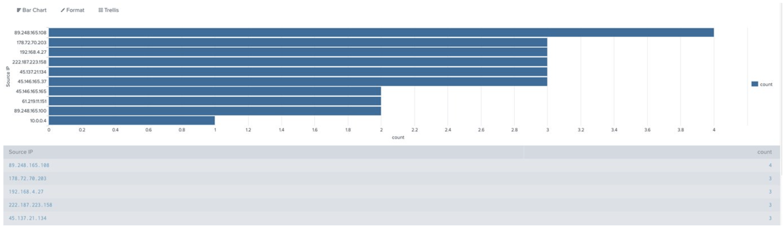
- Bar Charts: Bar charts enable easy comparison of data across different categories or groups, facilitating trend identification and comparisons.
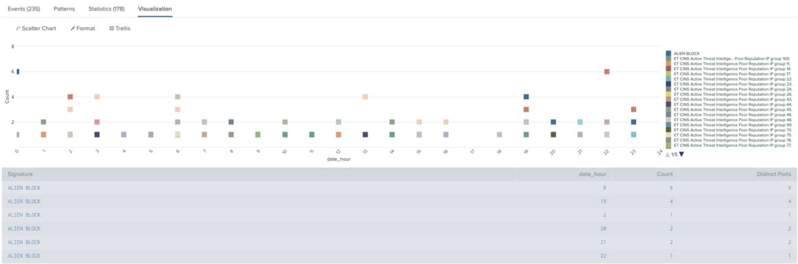
- Scatter Charts: Scatter charts display the relationship between two variables, highlighting potential correlations or outliers.
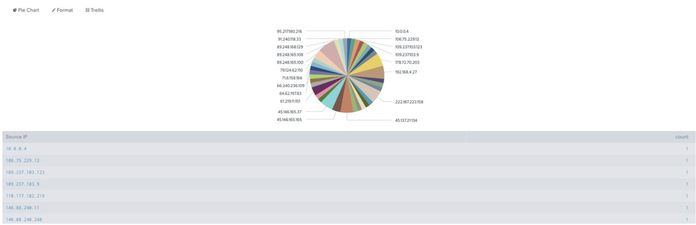
- Pie Charts: Shows how categories within a dataset compare to each other.
How to Use Splunk Visualizations
To harness the power of Splunk Visualizations, follow these step-by-step instructions:
Step 1: Define your data analysis goal and identify the specific insights you seek to extract.
Step 2: Select the appropriate visualization type based on your data and analysis requirements.
Step 3: Configure the visualization settings, including data source, time range, fields, and filters.
Step 4: Customize the appearance and layout of the visualization to enhance clarity and usability.
Step 5: Interact with the visualization to explore data subsets, drill down into details, and gain deeper insights.
Use Case Examples for Splunk Visualizations
To illustrate the practical applications of Splunk Visualizations, let’s explore two use case scenarios:
Use Case #1: IT System Performance Monitoring Scenario: An IT team aims to monitor system performance and identify potential bottlenecks affecting user experience. Tools: Splunk Enterprise, Server Logs, Line Charts, Pie Charts
Step 1: Define key performance indicators (KPIs) such as CPU usage, memory utilization, and response times.
Step 2: Utilize line charts to visualize performance trends over time and identify anomalies.
Step 3: Employ pie charts to identify problematic categories that are causing more issues than others within the environment.
Use Case #2: Fraud Detection in Financial Transactions Scenario: A financial institution wants to detect fraudulent transactions and identify patterns indicative of fraudulent activities. Tools: Splunk Enterprise, Transaction Data, Scatter Plots, Bar Charts.
Step 1: Define relevant transaction attributes to analyze, such as amount, location, and transaction type.
Step 2: Utilize scatter plots to identify suspicious patterns or outliers in the transaction data.
Step 3: Utilize bar charts to compare transaction volumes across different time periods and identify anomalies.
Conclusion
Splunk Visualizations empower users to unlock hidden insights within their data. By leveraging various visualization types, users can enhance their understanding of data, improve collaboration, and make data-driven decisions with confidence. Explore the outlined use cases and embrace Splunk Visualizations to unleash the full potential of your data. Remember, visualizations are the key to unraveling the power of data analysis and driving impactful outcomes.
If you found this helpful…
You don’t have to master Splunk by yourself in order to get the most value out of it. Small, day-to-day optimizations of your environment can make all the difference in how you understand and use the data in your Splunk environment to manage all the work on your plate.
Cue Atlas Assessment: Instantly see where your Splunk environment is excelling and opportunities for improvement. From download to results, the whole process takes less than 30 minutes using the button below: